Jumpiness
Summer 2019
Microsoft - Redmond, WA
Collaboration in Microsoft Word Online -- comments, @mentions & more.
When our team was releasing a redesign of comments in Word Online, users reported "jumpiness" -- unexpected and jarring movements that made them lose track of comments. Through usability testing we isolated the causes of jumpiness and prioritized interaction design changes that would smooth out the experience.
design statement
jobs to be done
Comments in Word feels "jumpy" which causes people to lose track of comments or even perceive they have lost their comment data completely.
People "hire" comments in Word to...
Have conversations about content directly in Word documents instead of having to go to another app (e.g. email, Teams chat) where it's more difficult to see how conversations refer to content.
Trust that collaborators will see their feedback/questions/etc. in comments any time -- whether they are working on the document now, or planning to look at it later.
In this case the problem of "jumpiness" is impacting both Jobs to be done: #1 mainly because "jumpiness" is making it hard to see how comments map to content in the document. #2 because "jumpiness" often makes comment authors think their comment was lost, and/or because comment deep links are failing to take collaborators to comments that need their attention.
This problem needs fixing, it's having a HUGE impact on the whole collaboration experience in Word!
stakeholders
"Jumpiness" was first discovered by Microsoft & LinkedIn employees (Dogfooding users), as they had first access to the recently-redesigned commenting experience. It was also reported by early-access users from the general public.
The team working on this issue included Microsoft Word Engineers, Product Managers & UX Designers. As a ship-blocking issue for comments and related collaboration features across all Microsoft Office platforms and services, this was also watched closely by Microsoft Office Executive Leadership.

process
Discovery & Usability Analysis:
"Jumpiness" issues were reported by users mainly via in-app feedback. LinkedIn also partnered closely with our team, allowing us to observe their workflows and narrow down specific causes of "jumpiness."
Sensemaking:
To start making sense of the different "jumpiness" issues reported by users, I led the engineering team in listing and categorizing many related feedback records. Once we saw feedback grouped in this way we were able to isolate several themes. The main causes of "jumpiness" were:
Several engineering-side bugs that causes the Word document to scroll incorrectly, especially when being opened from deep-links; this explained collaborators losing comments when following deep-links!
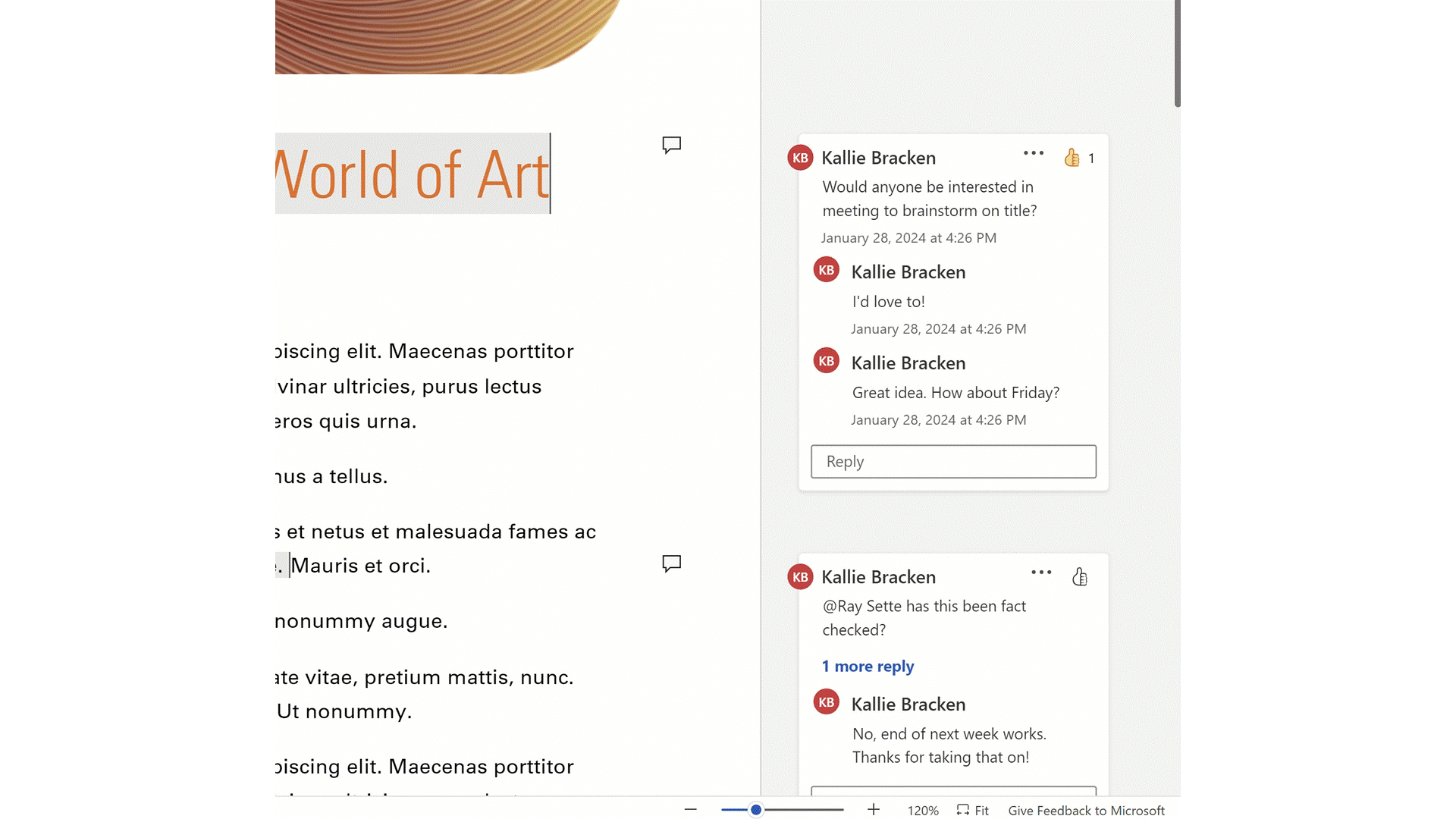
An interaction design which caused comments to move if users clicked them when they were partially out of view; we were moving selected comments into full-view so that they'd be easier to see. Clearly this movement wasn't as helpful as we thought -- it felt "jumpy" to users! And in some cases (e.g. long comments or many colocated comments) it was causing users to lose track of their comments completely... This explained why users thought their comments had disappeared completely!
A few smaller interaction design behaviors, such as automatically scrolling to in-progress drafts of comments if users had scrolled away from them then selected to make a new draft.
Prioritizating Design Improvements:
After the sensemaking stage of our work the team had a list of ~20 work items that engineers could work on to fix "jumpiness." However, we only had time to fix a few before launch... My next job was to prioritize these items based on how (and how much) they would improve the overall commenting experience for our users. In the end I identified just 3 to fix before launch, but these 3 were enough to solve the most severe and frequent problems. User feedback was great -- we had defeated the illusive "jumpiness" problem!
UX Changes:
In the end, the main UX change we made was to the way that comments moved when selected. Instead of moving comments into view, we simply left them in position -- allowing users to scroll them into view. Our hypothesis was that it would be more intuitive for users to control the scrolling themselves, which turned out to be true :)
The other changes that we made were engineering bugs -- in particular, the deep-link issues that caused the document to scroll incorrectly -- which, when fixed, removed other highly reported cases of "jumpiness."
key learnings
Usability issues don't always come from where you first expect! Users were reporting "jumpiness" and some of the causes were bugs that indeed caused document the document to scroll in a jarring way. However other causes weren't as straight forward--our initial design to move selected comments into view turned out to be jarring in its own way.
When time or resources are limited, find "out of the box" ways to solve usability issues by combining the expertise and creativity of engineers & designers. Without thinking in this way, we wouldn't have identified such a impactful balance of engineering bugs and UX changes to prioritize for compounding benefits.